The best living room oil paintings usually succeed because the buyer solves three decisions together: how large the work should feel on the wall, how its palette relates to the room, and how much visible painted surface the space can support. Buyers often ask only which subject they like, but a painting that looks attractive in isolation can still feel too small, too loud, too flat, or too decorative once it is placed above a sofa or opposite the main seating area.
This guide gives a practical answer for buyers comparing oil paintings for living room walls: start with the wall and furniture relationship, decide whether color should calm, anchor, or contrast with the room, and choose a texture level that still reads well from normal viewing distance. It is meant to help buyers move from vague taste language to practical wall decisions, then route them toward the right DafenArts path.
How To Choose Living Room Oil Paintings: Start With The Wall, Not The Thumbnail
Choose a living room oil painting by measuring the wall and nearby furniture first, then matching the painting’s scale, palette, subject, and surface texture to the room’s light and viewing distance. Once the scale is right, the buyer can decide whether the room needs warmth, contrast, softness, or more painterly texture. The same painting can feel balanced in one room and misplaced in another simply because the sofa width, wall color, light direction, and existing furniture change the way the work reads.
Living Room Oil Painting Size Guide For Sofa Walls And Large Walls
For searchers asking what size oil painting works above a sofa or on a large blank wall, the safest answer is a decision process, not a fixed formula. Use common wall-art ratios only as a starting point, then adjust for the actual furniture width, ceiling height, viewing distance, frame weight, and how much blank wall should remain around the painting.
| Placement | What to judge first | Best DafenArts next step |
|---|---|---|
| Above a sofa | Whether the artwork feels related to the sofa width without crowding the wall. | Choose a balanced horizontal work or request a custom crop if the wall needs a specific proportion. |
| Large blank wall | Whether the subject still reads clearly from the main seating distance. | Compare large Master Artists options, then use a custom-size review for unusual wall proportions. |
| Console, fireplace, or entry view | Whether the frame tone, wall color, and sightline make the painting feel stable. | Decide palette and frame direction before choosing a final size. |
1. Scale Should Relate To The Furniture Below
If the painting sits above a sofa, console, or fireplace, its width should feel intentional in relation to that anchor piece. A work that is too narrow often looks like an afterthought. A work that is too wide can feel crowded or unstable. Buyers should evaluate the wall as a composition, not only the painting size on paper.
When the wall is especially wide, a single large oil painting can work better than several small pieces because it gives the room one clear focal point. That choice still depends on viewing distance and subject readability. If the room needs an oversized focal piece, compare the living room plan with the extra large oil painting for wall size guide before choosing a final canvas direction.
For unusual wall conditions or room-specific dimensions, the custom oil painting path is the right next step. It is more useful to clarify the wall fit first than to order a generic size and hope it works later.
2. Color Should Respond To The Room, Not Duplicate It
A painting does not need to repeat the exact colors already in the room. It should either support the dominant palette, add controlled contrast, or introduce a calmer tonal field. In a beige or taupe room, a work with restrained blues, warm earths, or softened greens may create depth without shocking the space. In a darker room, too much muddy tone can make the wall feel heavy.
The useful decision is whether the room needs the painting to quiet the space, brighten it, or anchor it. Buyers should not treat color like a swatch match only. A painting is read through light, frame, wall tone, and upholstery all at once.
3. Surface Texture Changes The Feeling Of The Room
| Surface direction | What it adds | Best use case |
|---|---|---|
| Softly blended surface | Calm visual flow and quieter transitions. | Rooms that already have strong furniture texture or patterned rugs. |
| Moderate visible brushwork | Painterly presence without dominating the room. | Most living rooms with balanced natural and artificial light. |
| Heavier paint build | Stronger physical surface and gallery-like material presence. | Rooms with enough space and restraint around the painting. |

Asparagus by Edouard Manet - Hand-Painted Oil Reproduction
Asparagus painting (Master Studio)Est. Value Price range: $393.00 through $1,500.00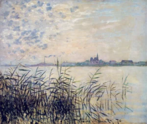
The Seine near Argenteuil - Serene Waters - Textured Oil
Argenteuil river landscape reproduction (Master Studio)Est. Value Price range: $393.00 through $725.00
The Sea, Port in Amsterdam - Maritime Scene - Textured Canvas
claude monet (Master Studio)Est. Value Price range: $393.00 through $725.00
The Sea at Amsterdam - Nautical - Textured Oil
claude monet (Master Studio)Est. Value Price range: $362.00 through $695.00
If you are comparing a real painted surface with a flatter decorative print effect, review giclee vs hand-painted oil painting and how to tell if an oil painting is hand-painted. Those pages help clarify what kind of texture and material presence you actually want on the wall.
4. Subject Choice Should Match The Room’s Visual Tempo
Some rooms benefit from a calm landscape, tonal abstract, or atmospheric city scene because the furniture already carries enough visual weight. Other rooms can handle a more dramatic focal painting because the surrounding design is quieter. The painting should respond to the room’s tempo, not fight it.
That is also why a living room buyer should think about viewing rhythm. Will the work be seen from the main sofa, from the entry into the room, or from a dining connection across the space? Subject and contrast should be judged at that real distance.
5. Frame Tone And Wall Color Complete The Decision
A frame can either stabilize the painting or overload it. Warm metallic tones, darker wood, light natural frames, or minimal profiles all change how the artwork sits against the wall. The correct choice depends on whether the room already has brass, walnut, black accents, or a more neutral language. Frame selection should never be treated as a separate decorative afterthought.
For buyers who want broader style comparison before deciding on a living room direction, the Master Artists collection is a useful verified browsing path.
6. When A Custom Living Room Oil Painting Makes Sense
A custom living room painting makes sense when the wall proportion, sofa width, crop, or color direction does not fit a standard ready-to-browse option. The useful brief is concrete: wall width, furniture below the painting, viewing distance, preferred subject, dominant room colors, desired texture level, and whether the buyer expects a stretched canvas, framed look, or other finishing review.
For very large works, confirm practical handling before treating the size as final. Shipping, stretching, framing, and wall access can affect the best format, so large-canvas requests should move through the custom oil painting path and the current shipping policy rather than relying on a generic size rule.
Quick Living Room Decision Checklist
- Measure the wall and the furniture below it.
- Decide whether the room needs calm tone, contrast, or stronger surface presence.
- Check the room in daylight and evening light.
- Choose whether the painting should blend, anchor, or become the dominant focal point.
- Consider frame tone together with wall color and furniture finishes.
When To Use DafenArts For A Living Room Painting Decision
Use the custom oil painting path when the wall size, crop, or palette needs to be adjusted for the room. Use the Master Artists collection when you want to compare painterly directions before locking the final look. For brand context, see About DafenArts.
Frequently asked questions.
Direct answers for buyers comparing hand-painted oil painting options, custom details, and the next step before ordering.
For a sofa wall, the painting should feel proportionate to both the sofa and the blank wall, not isolated or crowded. Start with the wall width, furniture below, and normal viewing distance before choosing a standard or custom size.
No. It should respond to the room, but copying a color swatch is less useful than deciding whether the painting should calm the room, brighten it, anchor it, or add controlled contrast.
No. Visible brushwork can add wall presence, but texture should match the room’s light, viewing distance, and existing materials. Some rooms need a quieter surface so the painting does not compete with upholstery, rugs, and lighting.
Use a custom-size path when standard dimensions do not fit the wall, sofa width, crop, or intended color direction. Confirming the room fit first is safer than forcing a generic size rule.
Decide the wall and furniture scale first, then choose the subject, color direction, and surface texture. Judge the frame after those choices are clear, because frame tone changes how the work sits against the wall.
One large oil painting is often stronger when the room needs a clear focal point, visible brushwork, and a calmer wall composition. A gallery wall can work when the room needs variety, but it requires more spacing, frame, and color coordination.